※ 반드시 앱 테마를 NoActionBar로 지정하세요!
In this tutorial we are going to implement sliding tabs in material design style by using the SlidingTabLayout from Google iosched app, The SlidingTabLayout is also provided on the Google developer page as well but it isn't updated with some methods such as setDistributeEvenly() and this method is actually needed to make fixed tabs, the Google ioshed version is more updated and so we are going to use that. Along with theSlidingTabLayout.java we would be needing the SlidingTabStrip.java, Okay so let's start making the Sliding Tabs.
Requirements
1. Android Studio 1.0.1 (latest)
2. SlidingTabLayout.java &SlidingTabStrip.java from IOsched Google App and copy past both the files in your project
Understanding Sliding Tab Layout Implementation

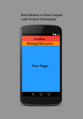 As you can see we have we have made the Linear Layout as the root element for our activity and made the orientation of the LinearLayout as vertical so the elements would be placed one after another, First I have added the toolbar on which I have already made a separate tutorial onhow to make a material design toolbar, Next element that I have added is the SlidingTabLayout which acts like a Tab Strip, you can place this strip anywhere in your layout but I want it to be above the pages that are being swiped so I am placing it just below the Toolbar, Next you add the View Pager which is required for swiping the pages. In the code you define every view and then set the SlidingTabs.SetViewPager method to the ViewPager in your activity which is where you tell the app that on page swipe of your View Pager you want the tabs to swipe and change as well.
Steps To Implement Sliding Tab Layout
1. First let's decide the color scheme for our app I want the color scheme to be red so lets do that by making a new color.xml file in your values folder and add the following code to it. You may notice a item in the color.xml with name ScrollColor that is the color which I am going to set to the scroll bar of the Tab Strip.
|
1
2
3
4
5
6
7
|
<?xml version="1.0" encoding="utf-8"?><resources> <color name="ColorPrimary">#e62117</color> <color name="ColorPrimaryDark">#c31c13</color> <color name="tabsScrollColor">#8a140e</color></resources> |
2. Next we need to make a layout file for toolbar and add that layout file to our apps activity_main.xml. So create a new layout file and name it tool_bar.xml and add the following code to it.
|
1
2
3
4
5
6
7
8
|
<?xml version="1.0" encoding="utf-8"?><android.support.v7.widget.Toolbar android:layout_height="wrap_content" android:layout_width="match_parent" android:background="@color/ColorPrimary" android:elevation="2dp" android:theme="@style/Base.ThemeOverlay.AppCompat.Dark" |
3. Now its time to add Toolbar and the SlidingTabLayout to our main_activity.xml, To add SlidingTablayout in your app you must make sure you have already added the SlidingTabLayout.java and SlidingTabStrip.java in your app as explained in the requirements section at the top. If you have added both the files in your project, open your main_activity.xml and add the following code to it. I have given the SlidigTabLayout an id ="Tabs" and added a elevation of 2dp for the shadow effect.
|
1
2
3
4
5
6
7
8
9
10
11
12
13
14
15
16
17
18
19
20
21
22
|
android:layout_width="match_parent" android:layout_height="match_parent" android:orientation="vertical" tools:context=".MainActivity"> <include android:id="@+id/tool_bar" layout="@layout/tool_bar" android:layout_height="wrap_content" android:layout_width="match_parent" /> <com.android4devs.slidingtab.SlidingTabLayout android:id="@+id/tabs" android:layout_width="match_parent" android:layout_height="wrap_content" android:elevation="2dp" android:background="@color/ColorPrimary"/></LinearLayout> |
4. Now we just have to add the ViewPager view to your layout, make sure to give it an Id, I have given my ViewPager an Id called pager. Finally your main_activiy.xml looks something like this.
|
1
2
3
4
5
6
7
8
9
10
11
12
13
14
15
16
17
18
19
20
21
22
23
24
25
26
27
28
29
30
31
32
|
android:layout_width="match_parent" android:layout_height="match_parent" android:orientation="vertical" tools:context=".MainActivity"> <include android:id="@+id/tool_bar" layout="@layout/tool_bar" android:layout_height="wrap_content" android:layout_width="match_parent" /> <com.android4devs.slidingtab.SlidingTabLayout android:id="@+id/tabs" android:layout_width="match_parent" android:layout_height="wrap_content" android:elevation="2dp" android:background="@color/ColorPrimary"/> <android.support.v4.view.ViewPager android:id="@+id/pager" android:layout_height="match_parent" android:layout_width="match_parent" android:layout_weight="1" ></android.support.v4.view.ViewPager></LinearLayout> |
5. Now I have decided to make 2 tabs for this project, so I have to make the layout for this tabs, so I have created two new layouts tab_1.xml and tab_2.xml and added the medium text view inside both the layout as shown below.
tab_1.xml
|
1
2
3
4
5
6
7
8
9
10
11
12
13
14
15
16
|
<?xml version="1.0" encoding="utf-8"?> android:layout_width="match_parent" android:layout_height="match_parent"> <TextView android:layout_width="wrap_content" android:layout_height="wrap_content" android:textAppearance="?android:attr/textAppearanceMedium" android:text="You Are In Tab 1" android:id="@+id/textView" android:layout_centerVertical="true" android:layout_centerHorizontal="true" /></RelativeLayout> |
tab_2.xml
|
1
2
3
4
5
6
7
8
9
10
11
12
13
14
15
16
|
<?xml version="1.0" encoding="utf-8"?> android:layout_width="match_parent" android:layout_height="match_parent"> <TextView android:layout_width="wrap_content" android:layout_height="wrap_content" android:textAppearance="?android:attr/textAppearanceMedium" android:text="You Are In Tab 2" android:id="@+id/textView" android:layout_centerVertical="true" android:layout_centerHorizontal="true" /></RelativeLayout> |
Now I am done with my layout section and its time to work things out in the code.
6. Now let's first make the 2 fragments for Tab1 and Tab2, So go ahead and create two new java files, name it Tab1 and Tab2 and add the following code to it.
Tab1
|
1
2
3
4
5
6
7
8
9
10
11
12
13
14
15
16
17
18
19
20
|
package com.android4devs.slidingtab;import android.os.Bundle;import android.support.annotation.Nullable;import android.support.v4.app.Fragment;import android.view.LayoutInflater;import android.view.View;import android.view.ViewGroup;/** * Created by hp1 on 21-01-2015. */public class Tab1 extends Fragment { @Override public View onCreateView(LayoutInflater inflater, @Nullable ViewGroup container, @Nullable Bundle savedInstanceState) { View v =inflater.inflate(R.layout.tab_1,container,false); return v; }} |
Tab2
|
1
2
3
4
5
6
7
8
9
10
11
12
13
14
15
16
17
18
19
|
package com.android4devs.slidingtab;import android.os.Bundle;import android.support.annotation.Nullable;import android.support.v4.app.Fragment;import android.view.LayoutInflater;import android.view.View;import android.view.ViewGroup;/** * Created by hp1 on 21-01-2015. */public class Tab2 extends Fragment { @Override public View onCreateView(LayoutInflater inflater, @Nullable ViewGroup container, @Nullable Bundle savedInstanceState) { View v = inflater.inflate(R.layout.tab_2,container,false); return v; }} |
7. Now before we start working with MainActiviy we need a ViewPager adapter to provide the views for every page i.e every Tab. So go ahead and make a new java file, name it ViewPagerAdapter and add the following code to it. I have added the comments to help you understand the working.
|
1
2
3
4
5
6
7
8
9
10
11
12
13
14
15
16
17
18
19
20
21
22
23
24
25
26
27
28
29
30
31
32
33
34
35
36
37
38
39
40
41
42
43
44
45
46
47
48
49
50
51
52
53
54
55
56
|
package com.android4devs.slidingtab;import android.support.v4.app.Fragment;import android.support.v4.app.FragmentManager;import android.support.v4.app.FragmentStatePagerAdapter;/** * Created by hp1 on 21-01-2015. */public class ViewPagerAdapter extends FragmentStatePagerAdapter { CharSequence Titles[]; // This will Store the Titles of the Tabs which are Going to be passed when ViewPagerAdapter is created int NumbOfTabs; // Store the number of tabs, this will also be passed when the ViewPagerAdapter is created // Build a Constructor and assign the passed Values to appropriate values in the class public ViewPagerAdapter(FragmentManager fm,CharSequence mTitles[], int mNumbOfTabsumb) { super(fm); this.Titles = mTitles; this.NumbOfTabs = mNumbOfTabsumb; } //This method return the fragment for the every position in the View Pager @Override public Fragment getItem(int position) { if(position == 0) // if the position is 0 we are returning the First tab { Tab1 tab1 = new Tab1(); return tab1; } else // As we are having 2 tabs if the position is now 0 it must be 1 so we are returning second tab { Tab2 tab2 = new Tab2(); return tab2; } } // This method return the titles for the Tabs in the Tab Strip @Override public CharSequence getPageTitle(int position) { return Titles[position]; } // This method return the Number of tabs for the tabs Strip @Override public int getCount() { return NumbOfTabs; }} |
8. Now we have everything ready to start work with the MainActivity.java, So go ahead and add the following code to your MainActivity.java. check out the comments in the code to understand the working.
|
1
2
3
4
5
6
7
8
9
10
11
12
13
14
15
16
17
18
19
20
21
22
23
24
25
26
27
28
29
30
31
32
33
34
35
36
37
38
39
40
41
42
43
44
45
46
47
48
49
50
51
52
53
54
55
56
57
58
59
60
61
62
63
64
65
66
67
68
69
70
71
72
73
74
75
76
77
78
79
80
81
82
|
package com.android4devs.slidingtab;import android.support.v4.view.ViewPager;import android.support.v7.app.ActionBarActivity;import android.os.Bundle;import android.support.v7.widget.Toolbar;import android.view.Menu;import android.view.MenuItem;public class MainActivity extends ActionBarActivity { // Declaring Your View and Variables Toolbar toolbar; ViewPager pager; ViewPagerAdapter adapter; SlidingTabLayout tabs; CharSequence Titles[]={"Home","Events"}; int Numboftabs =2; @Override protected void onCreate(Bundle savedInstanceState) { super.onCreate(savedInstanceState); setContentView(R.layout.activity_main); // Creating The Toolbar and setting it as the Toolbar for the activity toolbar = (Toolbar) findViewById(R.id.tool_bar); setSupportActionBar(toolbar); // Creating The ViewPagerAdapter and Passing Fragment Manager, Titles fot the Tabs and Number Of Tabs. adapter = new ViewPagerAdapter(getSupportFragmentManager(),Titles,Numboftabs); // Assigning ViewPager View and setting the adapter pager = (ViewPager) findViewById(R.id.pager); pager.setAdapter(adapter); // Assiging the Sliding Tab Layout View tabs = (SlidingTabLayout) findViewById(R.id.tabs); tabs.setDistributeEvenly(true); // To make the Tabs Fixed set this true, This makes the tabs Space Evenly in Available width // Setting Custom Color for the Scroll bar indicator of the Tab View tabs.setCustomTabColorizer(new SlidingTabLayout.TabColorizer() { @Override public int getIndicatorColor(int position) { return getResources().getColor(R.color.tabsScrollColor); } }); // Setting the ViewPager For the SlidingTabsLayout tabs.setViewPager(pager); } @Override public boolean onCreateOptionsMenu(Menu menu) { // Inflate the menu; this adds items to the action bar if it is present. getMenuInflater().inflate(R.menu.menu_main, menu); return true; } @Override public boolean onOptionsItemSelected(MenuItem item) { // Handle action bar item clicks here. The action bar will // automatically handle clicks on the Home/Up button, so long // as you specify a parent activity in AndroidManifest.xml. int id = item.getItemId(); //noinspection SimplifiableIfStatement if (id == R.id.action_settings) { return true; } return super.onOptionsItemSelected(item); }} |
Now everything is set, Lets just run our app and check out how it looks
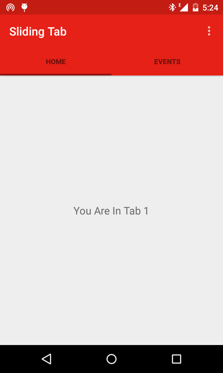
Its Looks perfect. Tabs are working nicely. But what if you want to customize the text color of your Tabs Title for a specific event i.e on Page selected etc and you surely would like to tell the user about the active tab he is on. For this you have to make aselector.xml in your res/color/ folder and add the following code to your selector.xml, of course change the colors as your requirements
|
1
2
3
4
5
6
7
|
<?xml version="1.0" encoding="utf-8"?> <item android:state_selected="true" android:color="@android:color/white" /> <item android:state_focused="true" android:color="@android:color/white" /> <item android:state_pressed="true" android:color="@android:color/white" /> <item android:color="#8a140e" /></selector> |
After making the selector you have to add it in your SlidingTabLayout.java, Look for a method called private void populateTabStrip() and add the following line of code at the end of it.
|
1
2
|
tabTitleView.setTextColor(getResources().getColorStateList(R.color.selector));tabTitleView.setTextSize(14); |
Look at the SlidingTabLayout code below, I have just copy pasted populateTabStrip() method in which you are suppose to do the changes
private void populateTabStrip() { final PagerAdapter adapter = mViewPager.getAdapter(); final View.OnClickListener tabClickListener = new TabClickListener(); for (int i = 0; i < adapter.getCount(); i++) { View tabView = null; TextView tabTitleView = null; if (mTabViewLayoutId != 0) { // If there is a custom tab view layout id set, try and inflate it tabView = LayoutInflater.from(getContext()).inflate(mTabViewLayoutId, mTabStrip, false); tabTitleView = (TextView) tabView.findViewById(mTabViewTextViewId); } if (tabView == null) { tabView = createDefaultTabView(getContext()); } if (tabTitleView == null && TextView.class.isInstance(tabView)) { tabTitleView = (TextView) tabView; } if (mDistributeEvenly) { LinearLayout.LayoutParams lp = (LinearLayout.LayoutParams) tabView.getLayoutParams(); lp.width = 0; lp.weight = 1; } tabTitleView.setText(adapter.getPageTitle(i)); tabView.setOnClickListener(tabClickListener); String desc = mContentDescriptions.get(i, null); if (desc != null) { tabView.setContentDescription(desc); } mTabStrip.addView(tabView); if (i == mViewPager.getCurrentItem()) { tabView.setSelected(true); } tabTitleView.setTextColor(getResources().getColorStateList(R.color.selector)); tabTitleView.setTextSize(14); } }
Finally, Everything is set and we are done. Let's just run the app and check out how things work.
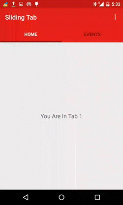
Well that's just looks amazing, So with this you have learned how to make Sliding Tabs in Material Design style, If you like this tutorial please subscribe to the blog for coming updates.
'프로그래밍' 카테고리의 다른 글
| [Android] Intent를 이용하여 GMail 보내기 (0) | 2019.04.23 |
|---|---|
| [C언어] scanf_s(%d %c %d) (0) | 2016.04.23 |
| [Andoird] 메테리얼 탭 아이콘적용하기(Material Sliding Tabs With Icons) (0) | 2015.10.11 |
| [Android] 메테리얼 디자인 색상 미리보기(MaterialPalette) (0) | 2015.10.11 |
| [Android] 이메일 보내기(GmailSender) (0) | 2015.06.04 |